


Table of Contents
In our previous post, we took a deep dive into what Indie Sleaze actually is—from its origins and cultural history to its core visual and stylistic elements. That piece was a hit with readers and sparked tons of enthusiastic feedback. By popular demand, we’re following up with this one—focused squarely on Indie Sleaze aesthetic home decor. We’ll walk you through how to style your space (whether it’s a bedroom, studio, or full apartment), how to balance the gritty, rebellious energy of the aesthetic without tipping into chaos, and how to keep things surprisingly cozy and livable. Consider this your go-to guide: pick and choose what resonates, and make the vibe yours.
So in this article, here’s what you can expect:
- Indie Sleaze Home Decor Key Features
- How to Style an Indie Sleaze Room
- Room Layout Guide
- DIY Indie Sleaze Decor Projects
- What to Avoid: Common Indie Sleaze Mistakes
Core Elements of Indie Sleaze Home Decor
Transforming your space into Indie Sleaze is like curating a never-ending late-night party—raw, unfiltered, and impossibly cool. Born from early-2000s urban nightlife and anti-mainstream energy, this aesthetic thrives on gritty authenticity, hedonistic charm, and a fiercely DIY spirit. Nail these foundational “bones,” and you’ve got the perfect framework to layer in your own personality, memories, and mess—on purpose.
Flashbulb Photography Aesthetic
At its core, this element is all about capturing and displaying—recreating that signature high-contrast, blown-out look of old-school camera flash: harsh, unapologetic, and dripping with nostalgia. Indie Sleaze photography isn’t about crisp, polished imagery; it’s about the imperfect magic of instant snaps—think Polaroids snapped at 2 a.m., slightly blurry, slightly overdeveloped, totally real.
Key Visual Touchpoints:
Polaroid / Film Photo Wall: The absolute heartbeat of the vibe. Cluster Polaroids, out-of-focus party shots, concert stubs, and scribbled-over notes across a wall—or string them up on twine like visual confetti. Crowded, chaotic, and deeply personal.

Flash Effect Accents: Lean into that pop of light. Use mirrors, crumpled aluminum foil, sequins, or metallic vinyl to catch and scatter light unpredictably—creating those random, eye-searing glints that feel like a flash just went off mid-conversation.

Low-Res Charm: Don’t shy away from pixelation. Print and frame grainy early-2000s blog screenshots, blurry MySpace-era selfies, or grainy YouTube thumbnails. These aren’t flaws—they’re artifacts. Proof you were there, in the digital trenches.

Raw Aesthetic
This is about rejecting polish and leaning hard into the “unfinished”—celebrating exposed textures, weathered surfaces, and the kind of imperfection that feels honest, even defiant.
Walls & Floors: Think exposed brick (bonus points for decades of grime), chipped paint peeling in slow motion, bare concrete floors (self-leveling, but never too smooth), and threadbare rugs that look like they’ve survived three warehouse parties and a breakup.
Furniture & Structure: Go for rough-hewn wood—knots, splinters, and all. DIY shelving that screams “I built this on a Sunday hungover” (brick-and-plank setups are iconic). And if a pipe or conduit runs across the ceiling? Leave it visible—as long as it’s safe. No drywall camouflage. Let the guts show.
The Mindset: This isn’t neglect—it’s intentional rawness. A middle finger to sterile, over-designed commercial spaces. It’s about honoring function, history, and the quiet poetry of wear. Your space isn’t supposed to look showroom-ready. It’s supposed to look lived-in—like the walls have stories, and the floor remembers every guest who danced too hard.
Color & Texture
Think of your palette like a late-night cityscape: neon signs buzzing against shadow-drenched alleyways—electric yet moody. And texture? It’s all about touch, grit, and the kind of tactile history that makes a space feel deeply human.

Color Palette:
Base Tones: Black, charcoal, burgundy, forest green, and muddy ochre—deep, saturated, and immersive. These aren’t just backgrounds; they’re moods. They swallow light, wrap you in atmosphere, and set the stage for everything else.
Pop Accents: Fluorescent pink, acid green, highlighter yellow—plus metallic hits of gold and chrome, deep violet, and electric sapphire. Use them sparingly, like flares in the dark: a vintage neon sign, a sequin pillow, a spray-painted pipe, or the glow of a flickering desk lamp. These are your flashbulb moments in color form—brief, brilliant, impossible to ignore.
Texture Play: Where Luxury Meets Grunge
This is controlled chaos—a deliberate clash of opulence and decay that feels thrilling, not sloppy.
Luxe vs. Wrecked: A crushed-velvet sofa slouched next to a burlap pillow with fraying seams. A silk slip dress casually tossed over a rickety wooden chair that’s seen better decades. It’s not about matching—it’s about tension. The richer the texture, the grittier the backdrop, the more alive the room feels.
Layered & Lived-In: Mix worn leather, faux (or vintage real) animal prints, chunky knit fringe, tarnished brass, crumpled foil taped to the wall like DIY wallpaper, and posters with torn, dog-eared corners. Every surface should beg to be touched—some smooth, some rough, some sticky in that “yeah, that’s from last weekend” kind of way.
Visual Static: Lean into the noise. Stack striped blankets over plaid sheets. Drape a pile of band tees—screen prints cracked, logos faded—over a radiator or the back of a couch. Let patterns compete, clash, and somehow harmonize in that beautifully unhinged, post-party-afterglow kind of vibe. Because in Indie Sleaze, silence isn’t golden—static is.
How to Style Your Space Without Creating Chaos
This is the make-or-break step—the heart of the whole aesthetic. The magic of Indie Sleaze lies in that razor-thin line between chaos and charisma: a space that feels thrillingly lived-in, buzzing with energy and narrative—but never actually sloppy. And let’s be clear: this isn’t about hoarding or haphazard clutter. The leap from “messy” to “richly layered, emotionally charged storytelling” hinges on one thing: visual intentionality.
Here’s how to crank up the tension—without letting the whole thing tip into meltdown:
Tip 1: Pick a Base Color
The base color is your space’s backstage curtain—quiet, commanding, and absolutely essential for setting the mood.
Here’s how to nail it: Pick one or two deep, moody tones—think charcoal black, slate gray, forest green, or oxblood—and roll them out across large surfaces: walls, floors, or major furniture pieces. Think of it like the dark gallery walls at a downtown art show: they don’t compete—they contain. They ground the chaos, mute the noise, and let every flash of neon, every Polaroid cluster, every ripped poster pop without floating away into visual static. This isn’t just a backdrop—it’s the anchor that keeps your beautifully messy world from tipping into overwhelm.
Tip 2: Make “Messy” Look Intentional
The difference between genuine style and pure clutter lies in intention and editing.
How to do it:
Set display rules: For example, confine photos to a single corkboard wall; stack magazines and books—either vertically or horizontally—in one dedicated corner; place all collected bottles on the same shelf. Rules create order.
Use uniform containers: Store small, scattered items in matching organizers—like black wire baskets or metal tins—so the exterior looks tidy, even if the inside stays delightfully chaotic.
Create visual “clusters”: Group related items together—like all your vinyl records or every camera you own—into cohesive, intentional displays, rather than letting them scatter piece by piece across the space.
Tip 3: Balance Low-Light & Harsh-Light Areas
Lighting is the invisible hand that shapes mood and carves out zones.
How to do it:
Keep ambient light low: Ditch harsh overheads. Rely instead on Himalayan salt lamps, warm-glow desk lamps, and natural light filtered through sheer or heavy curtains to establish a dim, laid-back baseline—the space’s “low-light zone.”
Add targeted highlights: Use spotlights, fairy lights, or LED strips to spotlight key areas—like your photo wall or display shelf. This mimics the burst of a camera flash, pulling focus exactly where you want it.
The result: This interplay of light and shadow—like the glow-and-gloom of a late-night club—maintains deep immersion while guiding the eye. In the spotlight, chaos becomes narrative; in the shadows, it melts into the atmosphere.
Tip 4: Layer Textures, Not Items
Depth comes from material contrast—not sheer quantity.
How to do it: Avoid overcrowding any one area with too many disparate objects. Instead, intentionally pair just a few materials with strong textural tension.
Classic combos:
- A velvet sofa + worn denim throw pillows + a faux-leopard throw.
- A sleek mirrored coffee table topped with a rusted metal ashtray and crumpled-foil “art.”
- A sequined slip dress hanging boldly against a raw, exposed brick wall.
The effect: Even with fewer items, the space feels rich, layered, and tactile—full of visual conversation. It sidesteps the clutter and fatigue of mere accumulation, trading noise for nuance.
Room Layout Guide: Indie Sleaze Without Overcrowding
The heart of Indie Sleaze is scene-making—and every room should play its own distinct role in the story. The living room is the raucous backstage afterparty; the bedroom, the quiet, intimate archive after the noise fades; the studio, the buzzing creative lab where ideas spark and splatter.
The key to layout isn’t about filling space—it’s about assigning each zone a clear functional character, then building layers around that purpose. That’s how you avoid dumping every aesthetic element into one overwhelmed, warehouse-like jumble.
Living Room Layout
The living room is the visual centerpiece—where Indie Sleaze gets to stretch out and shine, with room for bold, large-scale displays.
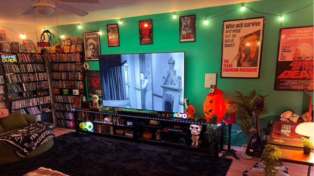
A full Polaroid photo wall fits perfectly: blurry, candid shots arranged by timeline or theme—not haphazardly, but with a loose, intentional rhythm that feels chaotic yet coherent.
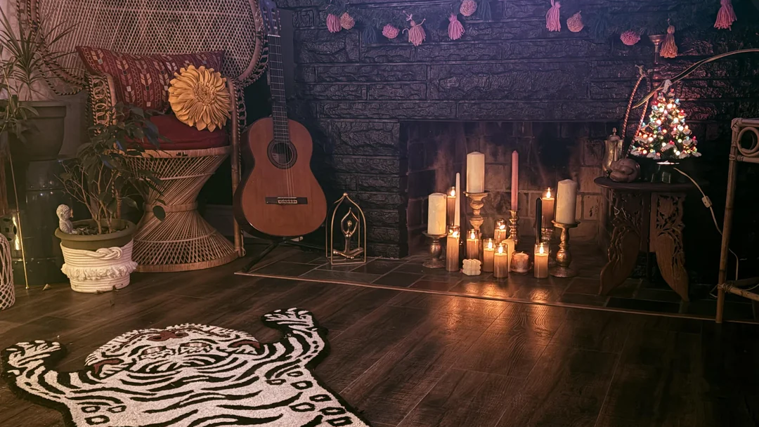
Place your record player on a low cabinet or dedicated stand, and never leave the wall behind it bare. Use wire grid panels or industrial shelving to display your favorite album covers like gallery pieces. Lean a guitar or bass casually beside it—just resting, like it was put down mid-session.
Posters are a classic move. Hang a few near the coffee maker or in your reading nook—opt for vintage-worn prints, and frame them for extra atmosphere.
Bedroom Layout
The bedroom is a more intimate zone—a space where you’re free to let your guard down and lean fully into personal expression.
A worn Persian-style rug or faux-fur throw rug: frayed edges and faded patterns add a touch of beautiful decay. Barefoot on its surface, swaying in the dim light—it instantly sets a romantic, unhurried mood.
A corkboard inspiration wall: mount one above or beside your desk, dotted with tiny twinkling LED lights. Pin up relics that matter—old ticket stubs, concert passes, postcards with scribbled notes—arranged not for neatness, but for resonance.
A vintage brass or black wrought-iron freestanding clothing rack: drape it with your boldest party pieces—sequined tops, vintage slips, band merch tees. It’s functional, sure—but also a striking visual moment.
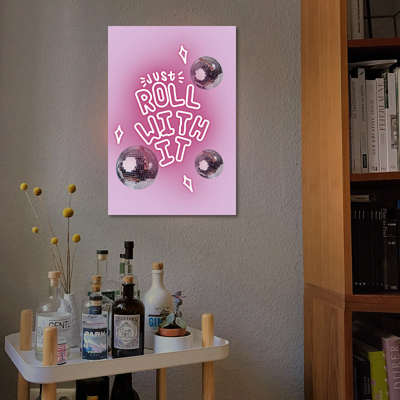
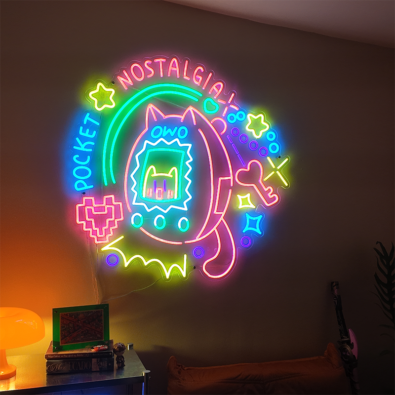
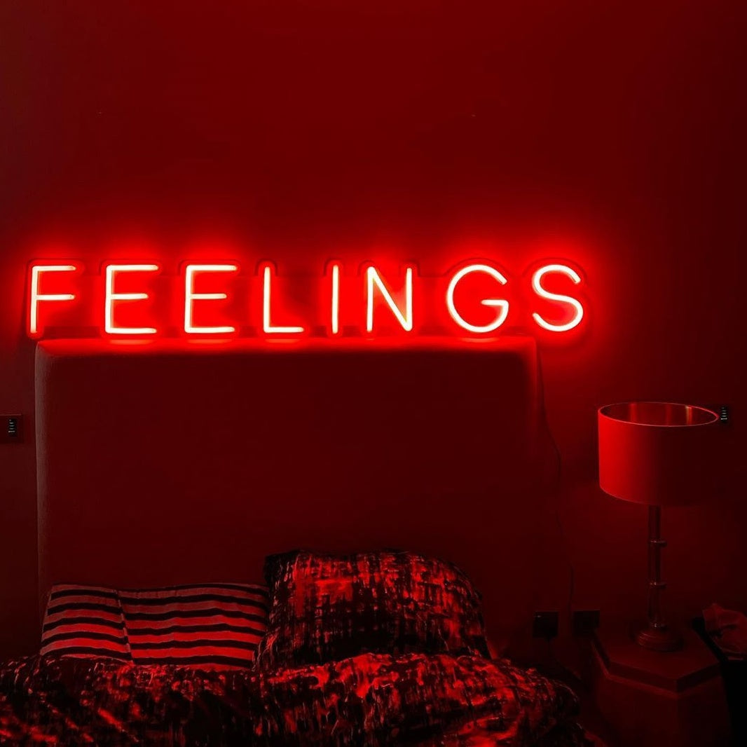
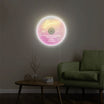
A custom neon sign: don’t overlook the power of that soft, colored glow. You don’t need it as a main light source—just perch it on a shelf or nightstand. Let it pulse faintly in the background, casting a dreamy, cinematic wash over the room.
What to Avoid: Common Indie Sleaze Mistakes
We all know the Indie Sleaze vibe walks a fine line—ordered chaos, not just chaos. Miss the mark, and it tips into straight-up messiness… and loses that essential cozy edge. So here are a few pitfalls to avoid, keeping your space sharp, intentional, and still deeply atmospheric.
Avoid Too Many Tiny Decorations
One of the quickest ways to invite clutter? Overloading with small decor items. Too many trinkets = visual noise. The fix? Group them—on a single shelf, in one tray—not scattered everywhere.
Avoid Overly Warm or Even Lighting
A common lighting mistake: leaning too hard into cozy, ambient warmth. Indie Sleaze isn’t hygge—it’s more nightclub than cabin. Go for moody dimness, punctuated by flickering neon, directional spots, or bare-bulb fixtures. Let shadows do their work.
Avoid Buying Too Much
It’s tempting—when you fall for the aesthetic, you want all the pieces. But in practice, you rarely need as much as you think. Instead of filling every corner, use the same budget to invest in fewer, more intentional (and higher-quality) items. Less stuff, more impact.
From Y2K’s futuristic transparent furniture and electric-bright hues to Indie Sleaze’s gritty, nostalgic record walls and moody low-light drama—this latest cycle of retro aesthetics is reshaping how we inhabit our homes. At its core, the trend reveals a deeper truth about interior design: we’re always reaching backward, trying to rebuild, within our private spaces, the emotional resonance and sense of safety a certain era evokes.
Whether it’s the optimistic digital shimmer of the early 2000s or the laid-back authenticity of indie music’s golden age, these aesthetics offer rich visual vocabularies for crafting deeply personal environments. Moving forward, home design will keep embracing this kind of temporal collage—where, under one roof, Y2K’s iridescent sheen might sit side by side with Indie Sleaze’s chipped brick wall. The real power of retro lies in this freedom to remix, to layer eras, and to author your own visual story. After all, the way a home looks is still the most honest reflection of the world inside us.