


Table of Contents
Currently, there are billions of font styles, but none can beat the charm of vintage fonts. From the elegant serifs of the Victorian era to the playful scripts of the mid-century, these typographic varieties offer you an interesting blend of style and history. According to Lummi, the pull of retro-inspired fonts remains strong in 2025, with typefaces from the 70s, 80s, and even early 2000s making a comeback. These are bold and expressive forms that splash a touch of vintage vibes, which were once on the list of early digital designs, recognized as officially retro now. If you’re all about typing, then you can infuse the theme in your personal space in the form of a neon sign as well. The blog will share the necessary details.
A Brief History of Vintage Typography
Vintage typography has evolved over time, with each era showcasing distinct characteristics. Below, we've compiled the core periods of vintage typography.
Early Typography
The initial typography’s roots go all the way back to Gutenberg’s movable type layout. However, the 19th century, which was driven by the Industrial Revolution, saw an outburst of new typefaces. For instance, slab serifs, sans-serif, and decorative display fonts appeared, moving ahead of traditional text faces.
Victorian Era
In the mid-to-late 19th century, the Victorian Era adapted to using detailed and ornamental typography. There was a boom of intricate serifs, highly adorned elements, and condensed letterforms, displaying how users loved embellishments and detailing in advertising and print materials.

Art Nouveau & Art Deco Flourishes
After the Victorian period, came the Art Nouveau in the early 20th century. It brought organic flowing lines and natural forms of typography. The style was followed by Art Deco, where the typography consisted of geometric shapes and a sense of modern sophistication, usually witnessed in posters and advertising.

Mid-Century Modern Simplicity
Once WWII ended, the mid-century movement made its way, where vintage fonts had clean lines, functionalism, and minimalist aesthetics. Typography became more accessible, where friendly scripts and sans-serif fonts dominated branding and printing, expressing a shift towards innovation.

Popular Styles of Vintage Fonts
The four core periods of vintage typography each correspond to distinct vintage font styles. Understanding the characteristics of each style will help us use them appropriately in our work and daily lives.
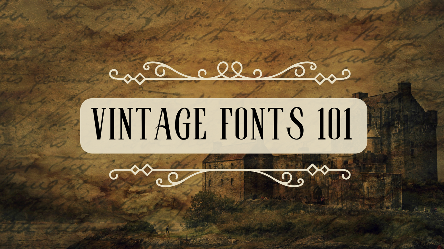
Victorian & Edwardian Era Fonts
Victorian and Edwardian era fonts are characterized by often highly decorative typefaces. These have intricate serifs that are shadowed or with embossed effects, and condensed letterforms. Recall old school advertisements, circus posters, or product labels from this time period, there were Slab serifs such as Clarendon with their thick, block-like serifs that left a prominent visual effect. Then decorative display fonts with swirls, gothic undertones, and flourishes, showing that they loved intricate design, triggering historical depth and the sense of the craftsmen.

Art Nouveau Fonts
The Art Nouveau fonts came in the late 19th and early 20th centuries and are famous for the organic, flowing lines, natural formations, and usually long and elegant characters. The typography drew inspiration from nature, as artists adjusted botanical motifs, a feeling of motion, and whiplash curves into their shape of letters. This style often appears as a whimsical, artistic, and sophisticated one, reflecting that era’s artistic vibe against the traditional academic vintage fonts.

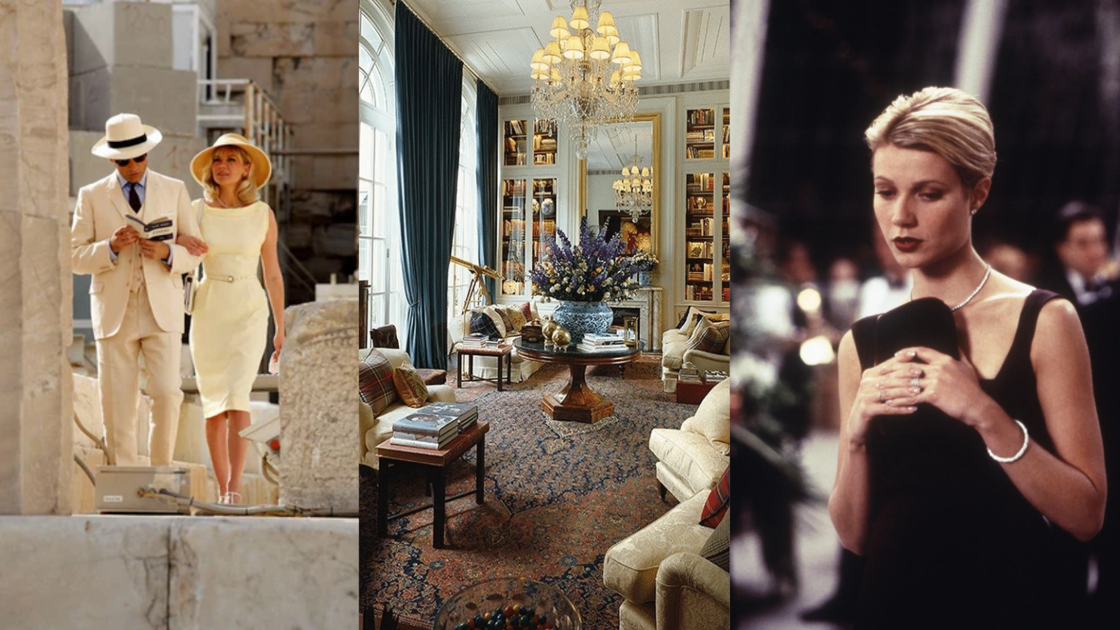
Art Deco Fonts
Art Deco typography gained immense fandom in the 1920s and 1930s. Its characteristics are geometric shapes, streamlined forms, robust verticality, and a sense of modernity. On top of that, the vintage fonts portrayed sharp angles, a sleek appearance, and symmetrical designs. Stimulating the glamour of the rise of industrial design, the Roaring Twenties, and the happiness of modernity. These were used in the posters of classic movies, jazz club signs, or brochures of luxurious liners. The font contains a uniform stroke weight, bold presence, displaying style, and confidence.
Mid-Century Modern Fonts
These vintage fonts stepped ahead as a relatively modern typography, reflecting on the time duration’s innovation, optimism, and a switch to cleaner and a functional design. For instance, sans-serif fonts such as Arial and Helvetica became popular for their minimalist aesthetic and easy readability. Along with these, there were other friendly scripts that had an informal touch, making them look as if they were hand-drawn. The natural appearance made them ideal for advertising and packaging products and services, which wanted to be approachable and invite customers. The style of font has a retro charm, and it is used in the images of classic diners and suburban life, representing a shift towards more impactful communication.
Retro & Kitsch Fonts
Vintage fonts from the 70s and 80s have a distinct style. The 1970s typography brought bold, psychedelic, or disco-inspired faces having round edges, really chunky forms, and at times exaggerated flourishes. Such fonts were used on album covers or roller in signages.
Whereas, the 1980s launched a combination of futuristic fonts, blocky and grid-like layouts, neon effects, and a greater digital aesthetic, expressing the rise of personal arcade and computing games. Leaving a nostalgic feeling while moving into a vibrancy and technological experimentation, with the subtlety of kitsch.
Where to Use Vintage Fonts?
Vintage fonts can be used in branding, editorial design, and creating digital projects in the following ways:
Branding
In the branding stage, vintage fonts act as a powerful tool, especially for companies that aim to add a sense of heritage, classic appeal, or craftsmanship. For instance, a local distillery can use it in their posters to deliver a rustic or old-time feeling, a boutique coffee shop to spread some cozy retro vibes, or a barber who wants to attract clients through a traditional and masculine distinction. A well-selected vintage font on a business card, logo, or storefront sign can immediately communicate the values, creating a memorable brand presence that stands out prominently from other designs.
Editorial Design
When it comes to editorial design, vintage fonts have the tendency of magically transport readers to another zone. The fonts sit perfectly on book covers, particularly historical fiction and classic literature re-publishing, offering an authentic feeling. Newspapers and magazines can make the most out of them for typing headlines or special feature sections to create nostalgic sensations or to highlight that the newspaper has something relevant to history. The creative department can infuse the vintage fonts as a theme to boost the readers' interest, taking them back to the actual era.
Digital Projects
Yes, vintage fonts can also secure their spot in modern digital projects. The website designers, social media handlers, and companies can enhance their digital advertisements by using these styles to develop a particular mood or theme, compelling the viewer to laugh and read the entire body. For instance, a vintage clothing store can add the fonts in their vintage blog category, or social media campaigns to promote their upcoming retro-themed gatherings or events. Utilizing these typefaces is absolutely no harm as they can transform your whole marketing material into a handcrafted and effective piece, garnering the interest of your target audience, who appreciate similar classic aesthetics.
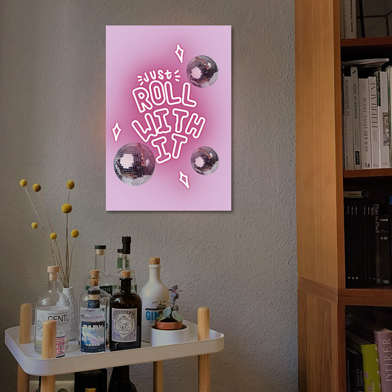
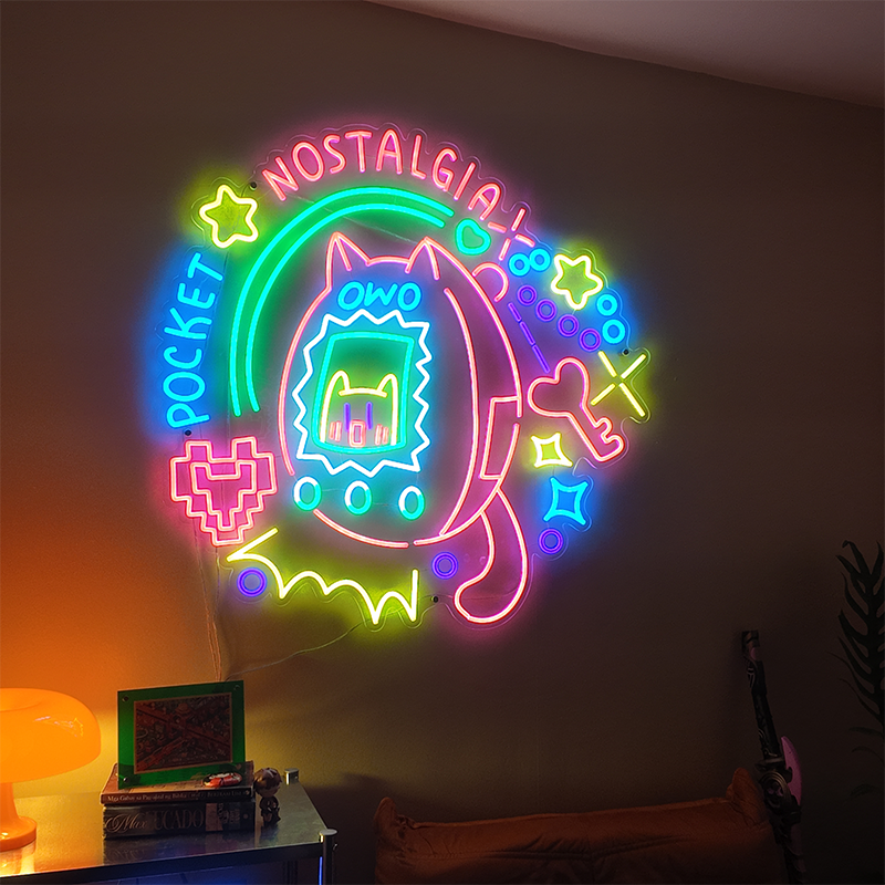
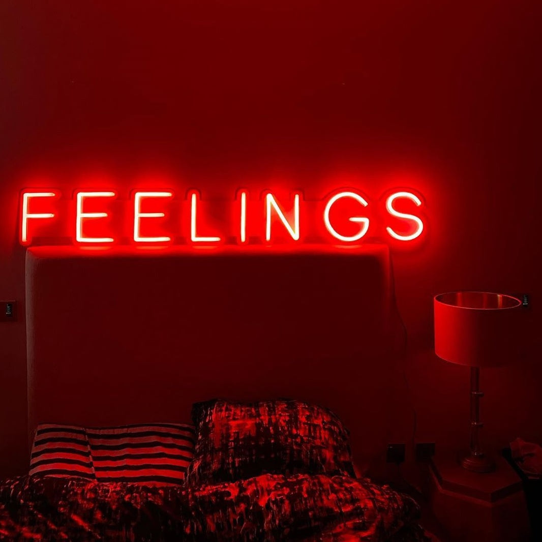
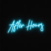
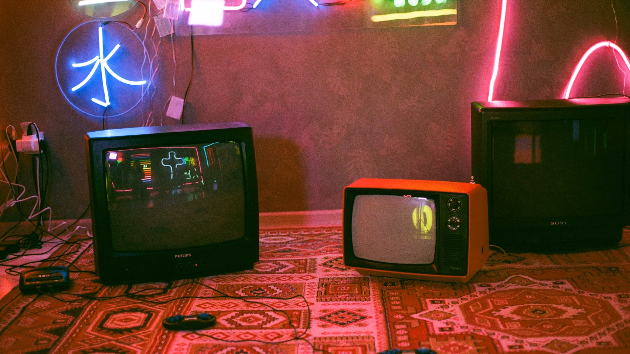
How to Use Vintage Fonts for Custom Neon Signs?
You must be familiar with neon signs' amazing retro appeal, which is why you want to pair them with vintage fonts. But you need to choose the right typefaces, whose results are not compromised after the digital design takes the shape of a glowing glass. Therefore, you must do the following so that your custom neon signs achieve the purpose:

Pick Simple Vintage Fonts
You will see many complicated vintage fonts, but the witty strategy is to pick the simple ones, which are legible and carry sans-serif fonts from eras like the Art Deco period, or classic diners. Imagine the flowing of light through the glass tubing; too much intricacy, thin lines, or extremely tight kerning can hinder the desired outcome. Your neon sign for room will be a challenge to read from a distance.
See The Era And Aesthetic
What style do you want to bring to your room? For instance, geometric Art Deco font is best for a decent and classic look. If you are aiming for a playful design, go for a mid-century diner feeling, brush scripts, or bold, rounded sans-serifs that transport you back to the 50s and 60s. Furthermore, make things easier for yourself by researching fonts used in original vintage signage, as that can provide you with better ideas and authenticity, preventing you from losing track or getting confused.
Top Resources for Vintage Fonts
After understanding the characteristics of vintage fonts from different periods, it's essential to know where to find these resources. This will help everyone access and use these classic vintage fonts for free. The top tools for vintage fonts are as follows:
Free Font Websites
There are a bunch of free font websites for separate projects or when you are experimenting with your design skills. Like others, you can even share your creations, usually under licenses to let you use the idea. Check out sites like Font Squirrel, very famous for impressing users with a range of premium-quality vintage fonts, free for commercial usage as well. Google fonts, DaFont and 1001 Free Fonts also top the list, but again, read their terms and conditions, as many of the fonts are free for personal tasks.
Premium Marketplaces
Besides websites, there are premium marketplaces such as Lamomoneon, which are quite popular for creating neon signs and neon lights for personal use or hanging them out at commercial spots too. Just enter your specification details with the vintage font, and their teams will give you a quote. Besides, there is MyFonts packed with thousands of such fonts and Adobe Fonts, stunning you with a huge library of designs that can be incorporated in your neon signs. Remember to read the pricing details and licensing for commercial applications.
Conclusion
Spend time choosing the perfect vintage fonts so your neon signs can be designed flawlessly as well. For the best pairing, proceed with "Custom Neon Signs with Lamomoneon"